
Why Internet is so costly in Zimbabwe
October 6, 2023
Effective Strategies to Make Better Product Packaging Decisions
October 8, 2023
Website design trends have come a long way since the early days of the web. In the 1990s, websites were often simple and text-based, with little focus on visual design. However, as the web evolved, website design became more sophisticated and visually appealing.
Today, website design trends are constantly evolving, as designers adopt new technologies and adapt to changing user expectations. In this blog post, we will take a look at some of the key website design trends from 1995 to 2023.

Website Design Trends from 1995 to 2023
Website design trends in the 1990s
In the 1990s, websites were often characterized by the following design trends:
- Bright, bold colors: Websites in the 1990s often used bright and bold colors, such as neon green, hot pink, and bright blue.
- Animated GIFs: Animated GIFs were also very popular in the 1990s. They were used to add movement and interest to web pages.
- Table-based layouts: Table-based layouts were the standard way to structure web pages in the 1990s. This was because early web browsers did not support CSS, which is now used to create more flexible and responsive layouts.
- Text-based content: Websites in the 1990s were often very text-based. This was because images and videos were difficult to load on early internet connections.
Website design trends in the 2000s
In the 2000s, website design trends began to shift towards a more minimalist and professional look. Some of the key trends from this era include:
- Flat design: Flat design is a minimalist design style that uses simple shapes and solid colors. It became popular in the 2000s as a reaction to the skeuomorphic design style, which was popular in the 1990s and early 2000s. Skeuomorphic design uses realistic textures and elements to make digital objects look like their real-world counterparts.
- Web 2.0: Web 2.0 is a term used to describe the second generation of the internet, which is characterized by user-generated content and social interaction. Websites in the 2000s began to incorporate more Web 2.0 features, such as blogs, forums, and social media integration.
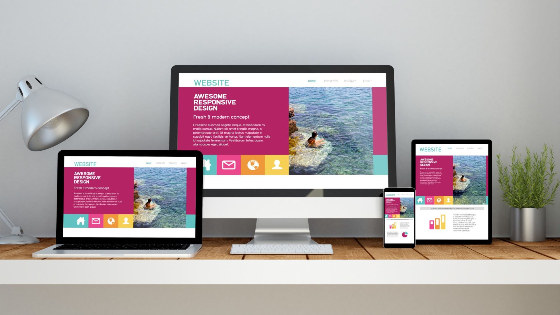
- Responsive design: Responsive design is a web design approach that makes websites look good and function well on all devices, from desktop computers to smartphones. It became increasingly important in the 2000s as more and more people began using mobile devices to access the web.
Website design trends in the 2010s
In the 2010s, website design trends continued to evolve, with a focus on simplicity, usability, and user experience. Some of the key trends from this era include:
- Card-based layouts: Card-based layouts are a popular way to organize content on websites. They are often used to display blog posts, product listings, and other types of content in a visually appealing way.
- Hero sections: Hero sections are large, attention-grabbing sections at the top of web pages. They are often used to display important information about the website, such as the company’s branding, mission statement, and call to action.
- Parallax scrolling: Parallax scrolling is a technique that creates the illusion of depth on a web page by moving different elements of the page at different speeds as users scroll.
- Hamburger menus: Hamburger menus are three horizontal lines that are used to hide navigation options on a web page. They are often used on mobile websites to save space and create a cleaner look.
Website design trends in the 2020s
In the 2020s, website design trends are focused on creating immersive and interactive experiences for users. Some of the key trends from this era include:
- Microinteractions:
Microinteractions are small, but meaningful interactions between users and websites. They can be used to provide feedback, make tasks more efficient, and add fun and engagement to the user experience.
Here are a few examples of microinteractions:
- The animation that plays when you hover over a button
- The sound that plays when you click on a link
- The vibration that your phone makes when you receive a notification
- The way that a shopping cart icon updates when you add an item to it
Microinteractions are often subtle, but they can have a big impact on the user experience. They can make websites feel more responsive and engaging, and they can help users to complete tasks more quickly and easily.
In the 2020s, microinteractions are becoming increasingly popular in website design. Designers are using them to create more engaging and user-friendly experiences.
Here are a few tips for using microinteractions in website design:
- Make sure that microinteractions are relevant to the task that the user is trying to complete.
- Use microinteractions to provide feedback to users.
- Use microinteractions to make tasks more efficient.
- Use microinteractions to add fun and engagement to the user experience.
With careful planning and execution, microinteractions can be a powerful tool for improving the user experience of your website.
In addition to microinteractions, there are a number of other website design trends that are focused on creating immersive and interactive experiences for users.
However, WordPress has become increasingly powerful in recent years, and it now offers a wide range of features and plugins that can be used to create immersive and interactive websites.
Here are a few examples of how WordPress can be used to create immersive and interactive websites:
- Microinteractions: Microinteractions are small, but meaningful interactions between users and websites. They can be used to provide feedback, make tasks more efficient, and add fun and engagement to the user experience. WordPress offers a number of plugins that can be used to create microinteractions, such as the WP Microinteractions plugin.
- Dark mode: Dark mode is a setting that allows users to switch the appearance of a website to a dark color scheme. It is becoming increasingly popular, as it is easier on the eyes and can save battery life on mobile devices. WordPress offers a number of plugins that can be used to implement dark mode, such as the WP Dark Mode plugin.
- 3D elements: 3D elements are becoming more and more common on websites. They can be used to create immersive experiences, such as product previews and virtual tours. WordPress offers a number of plugins that can be used to create 3D elements, such as the WP 3D Showcase plugin.
- Artificial intelligence (AI): AI is being used in a variety of ways to improve website design and user experience. For example, AI can be used to create personalized content recommendations, identify and fix accessibility issues, and optimize website performance. WordPress offers a number of plugins that can be used to implement AI features, such as the WP Personalize plugin.
With these trends in mind, website designers are creating more engaging and interactive experiences for users than ever before.
Website design trends and the transition from Joomla to WordPress
Website design trends have come a long way since the early days of the web. In the 1990s, websites were often simple and text-based, with little focus on visual design. However, as the web evolved, website design became more sophisticated and visually appealing.
Today, website design trends are constantly evolving, as designers adopt new technologies and adapt to changing user expectations. One of the key website design trends of the 2020s is a focus on creating immersive and interactive experiences for users.
This trend is evident in the transition from Joomla to WordPress. Joomla is a more complex and powerful CMS than WordPress, but it can be more difficult to learn and use. WordPress is a simpler and more user-friendly CMS, but it may not be as powerful for some websites.
If you are considering transitioning from Joomla to WordPress, there are a few things you need to keep in mind.
First, you need to make sure that your website is compatible with WordPress. You can do this by using the WordPress Compatibility Checker plugin.
Second, you need to decide how you want to migrate your Joomla content to WordPress. There are a few different ways to do this, but the most common method is to use a migration plugin.
Some popular Joomla to WordPress migration plugins include:
- FG Joomla to WordPress
- Akeeba Backup & Migrate
- Joomla Migration Assistant
Once you have chosen a migration plugin, you can follow the instructions to migrate your Joomla content to WordPress.
Once your content has been migrated, you will need to set up your WordPress website. This includes choosing a theme, installing plugins, and creating pages and posts.
If you are not familiar with WordPress, there are a number of resources available to help you get started. The WordPress Codex is a good place to start, and there are also many WordPress tutorials available online.
Here are some additional tips for transitioning from Joomla to WordPress:
- Make sure to back up your Joomla website before you start the migration process.
- Test your WordPress website thoroughly before you launch it.
- Redirect your old Joomla URLs to your new WordPress URLs.
- Update your WordPress website regularly to keep it secure and up-to-date.
With a little planning and effort, you can transition from Joomla to WordPress smoothly and easily. And, with the wide range of features and plugins available for WordPress, you can create an immersive and interactive website that will meet the needs of your users.
Conclusion
Website design trends have come a long way since the early days of the web. Today, website designers are using new technologies and innovative design techniques to create immersive and interactive experiences for users.
As we move into the future, we can expect to see even more innovative and exciting website design trends emerge. As AI and other technologies continue to evolve, we will see websites become more personalized, intelligent, and engaging.
FAQs
The key website design trends in the 1990s were:
- Bright, bold colors: Websites in the 1990s often used bright and bold colors, such as neon green, hot pink, and bright blue.
- Animated GIFs: Animated GIFs were also very popular in the 1990s. They were used to add movement and interest to web pages.
- Table-based layouts: Table-based layouts were the standard way to structure web pages in the 1990s. This was because early web browsers did not support CSS, which is now used to create more flexible and responsive layouts.
- Text-based content: Websites in the 1990s were often very text-based. This was because images and videos were difficult to load on early internet connections.
The key website design trends in the 2000s were:
- Flat design: Flat design is a minimalist design style that uses simple shapes and solid colors. It became popular in the 2000s as a reaction to the skeuomorphic design style, which was popular in the 1990s and early 2000s. Skeuomorphic design uses realistic textures and elements to make digital objects look like their real-world counterparts.
- Web 2.0: Web 2.0 is a term used to describe the second generation of the internet, which is characterized by user-generated content and social interaction. Websites in the 2000s began to incorporate more Web 2.0 features, such as blogs, forums, and social media integration.
- Responsive design: Responsive design is a web design approach that makes websites look good and function well on all devices, from desktop computers to smartphones. It became increasingly important in the 2000s as more and more people began to use mobile devices to access the web.
The key website design trends in the 2010s were:
- Card-based layouts: Card-based layouts are a popular way to organize content on websites. They are often used to display blog posts, product listings, and other types of content in a visually appealing way.
- Hero sections: Hero sections are large, attention-grabbing sections at the top of web pages. They are often used to display important information about the website, such as the company’s branding, mission statement, and call to action.
- Parallax scrolling: Parallax scrolling is a technique that creates the illusion of depth on a web page by moving different elements of the page at different speeds as users scroll.
- Hamburger menus: Hamburger menus are three horizontal lines that are used to hide navigation options on a web page. They are often used on mobile websites to save space and create a cleaner look.
Here are some tips for designing websites in the 2020s:
- Focus on user experience: The most important thing is to focus on the user experience. Make sure that your website is easy to use and navigate, and that it provides a positive experience for your users.
- Use immersive and interactive elements: Immersive and interactive elements can help to make your website more engaging and memorable for users. However, be careful not to overuse them, as this can be overwhelming.
- Personalize the experience: Use AI to personalize the experience for each user. This will help to keep them engaged and coming back for more.
- Make your website accessible: Make sure that your website is accessible to people with disabilities. This is not only the right thing to do, but it is also good for business.
- Keep up with the latest trends: Stay up-to-date on the latest website design trends. This will help you to create a website that looks and feels modern and professional.
The key website design trends in the 2020s are:
- Immersive and interactive experiences: Website designers in the 2020s are focused on creating immersive and interactive experiences for users. This is achieved through the use of new technologies and design techniques, such as microinteractions, dark mode, 3D elements, and artificial intelligence (AI).
- Personalization: Website designers are also using AI to create personalized experiences for users. This means that users are shown content and offers that are relevant to their interests and needs.
- Accessibility: Website designers are also increasingly focused on accessibility. This means that they are designing websites that can be used by people with disabilities.
Here are some tips for designing websites in the 2020s:
- Focus on user experience: The most important thing is to focus on the user experience. Make sure that your website is easy to use and navigate, and that it provides a positive experience for your users.
- Use immersive and interactive elements: Immersive and interactive elements can help to make your website more engaging and memorable for users. However, be careful not to overuse them, as this can be overwhelming.
- Personalize the experience: Use AI to personalize the experience for each user. This will help to keep them engaged and coming back for more.
- Make your website accessible: Make sure that your website is accessible to people with disabilities. This is not only the right thing to do, but it is also good for business.
- Keep up with the latest trends: Stay up-to-date on the latest website design trends. This will help you to create a website that looks and feels modern and professional.
Here are some additional tips:
- Use a responsive design: This will ensure that your website looks good and functions well on all devices, from desktop computers to smartphones.
- Use high-quality images and videos: Visual content is very important for websites. Make sure to use high-quality images and videos to make your website look more appealing and engaging.
- Write clear and concise copy: Your website content should be clear, concise, and easy to read. Avoid using jargon and technical terms that your users may not understand.
- Test your website: Before you launch your website, be sure to test it thoroughly on different devices and browsers. This will help to ensure that it is working properly and that there are no errors.
By following these tips, you can design a website that is both visually appealing and user-friendly.

